
Part 18. This is the death state rankings sorted by ‘age-adjusted’ population, divided by Red and Blue, over stating population, or under stating deaths.
 UTopiAH. This is Part of a series for comparing census based life expectancy and death rate tables, ranking states by how long we live, from 1960 to 2015. Included are medical conditions rating Utah’s #1 health rankings. After 2012, state rankings are now correlated to voting in the 2012 and 2016 presidential elections, with Blue states on top, and Red states assigned to the bottom. Utopia is Sir Thomas More’s (1516) perfect place to live, and with a slight variation in spelling, perfectly describes Utah.
Part 18. This is the death state rankings sorted by ‘age-adjusted’ population, divided by Red and Blue, over stating population, or under stating deaths.
Doctrine and Covenants Section 89 – verse. 18 And all saints who remember to keep and do these sayings, walking in obedience to the commandments, shall receive healthi n their navel and marrow to their bones;
Table 12. Number of deaths, death rates, and age-adjusted death rates for major causes of death: United States, each state, p. 49
National Vital Statistics Reports, Vol. 66, No. 6, November 27, 2017 49
All causes Age- adjusted population Number Rate rate1
Rates per 100,000 population; age-adjusted rates per 100,000 U.S. standard population; see Technical Notes. Codes in parentheses after causes of death are categories of the International Classification of Diseases, Tenth Revision (ICD–10). The asterisks (*) preceding cause-of-death codes indicate they are not part of ICD–10; see Technical Notes]
Age adjustment down to a lower rate, increases life expectancy and moves to a higher rank.
NO BLUE State was age adjusted to a higher rating, or worse ranking. The Single District was adjusted upward. Four Red states had their age adjusted rating increased over the rate, dropping them in the longevity rankings.
| ALL CAUSES – disease Mortality by state |
SORTED Column E BY AGE adjusted population rate lowest to highest, and Red and Blue 2016 election.
| Higher age adjusted death rate (lower – worse ranking) Red | Higher age adjusted rate (lower – worse rank
Blue | B 2015, number of Deaths – K-thousands,
| D from Tab 12 NVSR, 27 Nov 2017
| E Age Adjusted death rates NVSR 27 Nov 2017 | Lower age adjusted death rate (hence higher – better rank) Red | Lower age adjusted death rate (higher – better rank) Blue |
| – | – | 11,053 | 772.1 | 588.2 | – | Hawaii | |||
| – | – | 259,206 | 662.2 | 621.6 | – | California | |||
| – | – | 153,628 | 776.1 | 644 | – | New York | |||
| – | – | 42,800 | 779.7 | 653.8 | – | Minnesota | |||
| – | – | 30,535 | 850.3 | 656.1 | – | Connecticut | |||
| – | – | 191,737 | 945.9 | 662.9 | Florida | – | |||
| – | – | 36,349 | 666.2 | 665 | – | Colorado | |||
| – | – | 72,271 | 806.8 | 666 | – | New Jersey | |||
| – | – | 54,299 | 795.2 | 671.8 | Arizona | – | |||
| – | – | 57,806 | 850.8 | 684.8 | – | Massachusetts | |||
| – | – | 54,595 | 761.4 | 687.4 | – | Washington | |||
| – | – | 6,223 | 822.1 | 696.8 | North Dakota | – | |||
| – | – | 47,247 | 786.6 | 705.7 | – | Maryland | |||
| Utah | – | 17,334 | 578.6 | 712.1 | – | – | |||
| – | – | 5,919 | 945.5 | 714.7 | – | Vermont | |||
| – | – | 7,731 | 900.6 | 715.4 | South Dakota | – | |||
| – | – | 51,264 | 888.3 | 715.9 | Wisconsin | – | |||
| – | – | 11,984 | 900.6 | 720.6 | – | New Hampshire | |||
| – | – | 65,577 | 782.3 | 721.6 | – | Virginia | |||
| – | – | 10,163 | 962.1 | 721.9 | – | Rhode Island | |||
| – | – | 35,7054 | 886.2 | 722.3 | Oregon- | ||||
| – | – | 29,600 | 947.5 | 724.6 | Iowa | – | |||
| – | – | 13,026 | 787.1 | 727.8 | Idaho | – | |||
| – | – | 106,872 | 831 | 728,3 | – | Illinois | |||
| – | – | 2,712,630 | 844 | 733.1 | United States2 | –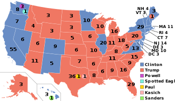 | |||
| – | – | 16,740 | 882.8 | 739.2 | Nebraska | – | |||
| – | – | 8,582 | 907.3 | 741.5 | – | Delaware | |||
| – | – | 17,685 | 848.2 | 741.5 | – | New Mexico | |||
| Texas | – | 189,654 | 690.4 | 745 | – | – | |||
| Alaska | – | 4,316 | 584.5 | 747.4 | – | – | |||
| – | – | 4,778 | 815.2 | 748.3 | Wyoming | – | |||
| – | District of Columbia | 4,871 | 724.6 | 748.6 | – | – | |||
| – | – | 22,879 | 791.4 | 757.2 | – | Nevada | |||
| – | – | 9,942 | 962.5 | 762.7 | Montana | – | |||
| – | – | 132,598 | 1035.7 | 768.3 | Pennsylvania | – | |||
| – | – | 26,664 | 915.8 | 774.1 | Kansas | ||||
| – | – | 14,479 | 1089.2 | 783.5 | – | Maine | |||
| – | – | 95,140 | 958.8 | 784.4 | Michigan | – | |||
| – | – | 89,133 | 887.5 | 789.9 | North Carolina | – | |||
| Georgia | – | 79,942 | 782.6 | 808.1 | – | – | |||
| – | – | 59,871 | 984.1 | 816.9 | Missouri | – | |||
| – | – | 118,188 | 1,017,7 | 828.4 | Ohio | – | |||
| – | – | 62,713 | 947.4 | 833.9 | Indiana | – | |||
| – | – | 47,198 | 964 | 840 | South Carolina | – | |||
| – | – | 43,716 | 936 | 874.2 | Louisiana | – | |||
| – | – | 66,570 | 1008.6 | 886.4 | Tennessee | – | |||
| – | – | 31,617 | 1,061 | 901.8 | Arkansas | – | |||
| – | – | 39,422 | 1,007.9 | 904.3 | Oklahoma | – | |||
| – | – | 51,909 | 1,068.3 | 924.5 | Alabama | – | |||
| – | – | 46,564 | 1052.3 | 924.7 | Kentucky | – | |||
| – | – | 22,752 | 1233.8 | 943.4 | West Virginia | – | |||
| – | – | 31,783 | 1062.1 | 963.7 | Mississippi | – | |||
50 National Vital Statistics Reports, Vol. 66, No. 6, November 27, 2017
Table 12. Number of deaths, death rates, and age-adjusted death rates for major causes of death: United States, each state, Puerto Rico, Virgin Islands, Guam, American Samoa, and Northern Marianas, 2015—Con.
[Rates per 100,000 population; age-adjusted rates per 100,000 U.S. standard population; see Technical Notes. Codes in parentheses after causes of death are categories of the International Classification of Diseases, Tenth Revision (ICD–10). The asterisks (*) preceding cause-of-death codes indicate they are not part of ICD–10; see Technical Notes]
Motor vehicle accidents3
Accidental poisoning and exposure to noxious substances (X40–X49)
Intentional Assault self-harm (suicide) (homicide)
Accidental poisoning Intentional Motor vehicle and exposure to noxious self-harm (suicide)
accidents3 substances (X40–X49) (*U03,X60–X84,Y87.0)
Assault (homicide) (*U01–*U02,X85–Y09,Y87.1)
2016 Red Republican Trump, Blue Democratic Hillary
Life expectancy: The expected average number of years of life remaining at a given age. It is denoted by ex , which means the average number of subsequent years of life for someone now aged x. Life expectancy estimates for 2015 are based on a methodology first implemented with 2008 final mortality data (4). Life expectancies for 2014 were revised using updated Medicare data; therefore, figures may differ from those previously published (5).
Data source and methods
The data shown in this report reflect information collected by NCHS for 2014 and 2015 from death certificates filed in all 50 states and the District of Columbia and compiled into national data known as the National Vital Statistics System. Death rates shown in this report are calculated based on postcensal population estimates as of July 1, 2014, and July 1, 2015, which are consistent with the April 1, 2010, census. Differences between death rates were evaluated using a two-tailed z test.
National Center for Health Statistics
The above NVSS explains that the longevity was changed in 2008, to favor Blue state over Red states.
Disclaimer: The author of each article published on this web site owns his or her own words. The opinions, beliefs and viewpoints expressed by the various authors and forum participants on this site do not necessarily reflect the opinions, beliefs and viewpoints of Utah Standard News or official policies of the USN and may actually reflect positions that USN actively opposes. No claim in public domain or fair use. UTopiAH is a trade mark of the author. Utopia was written in 1516 by Sir Thomas More, Chancellor of England. © Edmunds Tucker.
Utah Standard News depends on the support of readers like you.
Good Journalism requires time, expertise, passion and money. We know you appreciate the coverage here. Please help us to continue as an alternative news website by becoming a subscriber or making a donation. To learn more about our subscription options or make a donation, click here.
To Advertise on UtahStandardNews.com, please contact us at: ed@utahstandardnews.com.
Comments - No Responses to “Part 18. This is the death state rankings sorted by ‘age-adjusted’ population, divided by Red and Blue, over stating population, or under stating deaths.”
Sure is empty down here...