
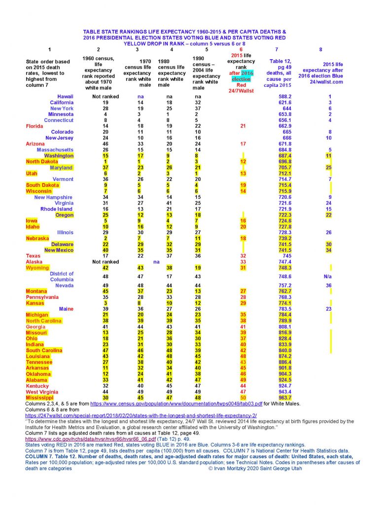
Part 113. Table of State Rankings for Life Expectancy 1960-2015 & Per Capita Deaths & 2016 Presidential election Blue and Red – CDC 24/7 WallSt Univ. of Washington and NCVS
2016 PRESIDENTIAL ELECTION STATES VOTING BLUE AND STATES VOTING RED
YELLOW DROP IN RANK – column 5 versus 6 or 8
Part 113. Table for Center for Disease Control and National Center for Health Statistics (NCHS) about state rankings of mortality and life expectancy which correlate with 2016 Presidential Election Blue versus Red States results. Red state residents die sooner, Blue state residents die later. Are the metrics relating to deaths from COVID-19 or China Virus accurate?
UTopiAH. This is Part 113 of a series for comparing census based life expectancy and death rate tables, ranking states by how long Americans live, based on the census from 1960 to 2015. After the 2016 presidential elections, states were rearranged according to the election results, Blue states moved to the top as having longest life expectancy, and Red States assigned to the bottom of the list.
The National Center compiles deaths in America. As noted in the previous 3 dozen columns beginning in 2018, the death metrics closely correlate to the results of the 2016 election and how each state voted its support. The above table has the results color coded, Blue states, and Red states
In April of 2020, controversy over handling of the economy and the CDC’s recommendations became news. For instance, as Texas reopened it’s economy, Dr. Fauci publicly criticized Texas. Thereupon the Texas Lieutenant Governor Patrick pushed back. All was done with the background of daily reports from the CDC of cases and deaths for a single malady, with recommendations for quarantining the entire United States.
Inquiry was made to the CDC Director, Dr. Robert R. Redfield asking to clarify the correlation between voting and state ranking of death and life longevity. Were any metrics to be believed? The inquiry went as follows, referring to the above table.
Question to the CDC. Do you have any comment on these columns in the UtahStandardNews? Specifically, the 2017 report [National Center for Health Statistics] rearranged state rankings so that states voting blue in 2016 filled the top ten (best life expectancy), and states voting red filled the bottom ten (lowest life expectancy). The question raised was whether the new model was based on created fake metrics, specifically designed to give the pre determined results.
The Associate Director for Science, National Center for Health Statistics replied in part.
Mortality statistics are produced from death certificates reported by state vital statistics offices to NCHS as part of the National Vital Statistics System, and information on deaths, death rates, and life expectancy has been published by NCHS since its inception in 1960. The legal authority for the registration of births and deaths in the U.S. resides with the states, while NCHS is the federal agency legislatively mandated to produce statistics on births and deaths for the nation.
NCHS has not produced rankings of state life expectancy in any official report or publication, although we have provided estimates of state life expectancy for 2010-2015 through the U.S. Small-area Life Expectancy Estimates Project (USALEEP). This project produced life expectancy estimates at birth for most of the census tracts in the United States for the period 2010-2015, and was a partnership between NCHS, the Robert Wood Johnson Foundation (RWJF), and the National Association for Public Health Statistics and Information Systems (NAPHSIS) (https://www.cdc.gov/nchs/nvss/usaleep/usaleep.html ). These data are available to the public and may be used by others to create their own presentations including rankings.
Further question to the NCHS.
Appreciating your reply, you wrote ”NCHS has not produced rankings of state life expectancy in any official report or publication”. However Life Expectancy is mentioned a dozen times in this report –
A Report dated Nov 27, 2017, Volume 66, Number 6, has the CDC NCHS NVSS on the cover page at the bottom. Table 12 p 49 et seq. lists ‘number of deaths, death rates, and age-adjusted death rates etc.’ by states and United States. The table is referenced in the UtahStandardNews columns, and is referenced by several media columns ranking states by death rates.
Is this report and table from NCHS? Or, from whom or where was this table compiled?
The National Center for Health Statistics replied in part.
The report and table you reference were produced by NCHS. The report is the annual 2015 Final Mortality Report. The table is a standard table in the annual report and as you note provides state specific counts of deaths, death rates and age adjusted death rates but it does not show life expectancies. In addition, the table does not rank states but shows states in alphabetical order.
Further question to the NCHS.
The reply states ‘death rates and age adjusted death rates but it does not show life expectancies’ in referring to the table in the 2017 report. Is there is any correlation between death rates and life expectancies? The reply might be interpreted as denying any such.
[As previously noted] MSNBC, 24/7Wall street, relied on the University of Washington, which relied on the report to rank states based on the death rate and ‘age adjusted’ death rates. The query asked ‘Specifically, the 2017 report rearranged state rankings so that states voting blue in 2016 filled the top quintile (best life expectancy), and states voting red filled the bottom quintile (lowest life expectancy). The question raised was whether the new model was based on created fake metrics, specifically designed to give the pre determined results.’
If there is no correlation, then the studies and reports by MSNBC, 24/7Wall Street, and UofW are false.
This does not really address the question about Blue states in the top quintile, and Red states in the bottom quintile.
The 2017 report from the CDC’s National Center for Health Statistics data on death rates assigned to the 30 RED States, after the 2016 election, age adjusted death rates which collapse the relative positions of the states down a total of 154 place rankings. While the BLUE states, after the same 2016 election, rose 155 places in death rate rankings, a swing difference of over 300 places. Red states moving up totaled 4, Blue states moving up totaled 13. Two Red and two Blue states had no change. Red states moving down totaled 24, Blue states moving down totaled 4.
Utah ranked 38th highest in 2017, down in 2004 from 1st, net rankings down 12 places.
Wisconsin 37th highest in 2017, down in 2004 from 44th of 50, net rankings down 7.
Iowa 35th highest in 2017 down in 2004 from 43rd of 50, net rankings down 8. ? Iowa was 45th highest 1960, 41st 1970, 46th 1980, 43rd 1990 meaning only 6 states had better life expectancy.
Nebraska ranked 49th in 1960, 44th in 1970 and in 1980, and 39th out of 50 in 1990. After 2017 it ranked 33rd, down 6 more places. It’s previous biggest drop was 4 places.
New York. After the 1960 census New York life expectancy ranked 22nd, in 1970 ranked 31st, in 1980 ranked 26th, from 1990 to 2004, New York ranked 14th. The 2017 report from the CDC’s National Center for Health Statistics exploded New York up into the top quintile, ranking 45th best of 50 states, moving up 32 places. This was the best improvement of any state ever, just beating out California’s 30 place explosion between 2004 and 2017.
The rest of the states are listed in the attachment. How is such a pattern possible?
The Associate Director for Science, National Center for Health Statistics replied in part.
I did not mean to imply that death rates and life expectancy are not related. Both measures are based on counts of deaths, but these measure are not the same and we would not necessarily expect a one-to-one correlation between the death rate and life expectancy. Jurisdictional vital records office send death records to NCHS where they are compiled to create national data files which are made available for analysis by NCHS and non-NCHS researchers. Reports by non-NCHS analysts will likely list NCHS as the source of the death data even when NCHS was not involved in producing the report. The report of life expectancy rankings is not in an NCHS report and, as I mentioned, the 2017 NCHS report you reference did not rank states by death rates nor did it provide state life expectancies. I can assure you that there has been no change in how NCHS calculates death rates or age adjusted death rates in our reports – standard demographic methods are used.
I cannot comment on the attachment’s reports of state life expectancy as these are not NCHS statistical products.
Further question to the NCHS.
[The CDC response is] ”The report of life expectancy rankings is not in an NCHS report and, as I mentioned, the 2017 NCHS report you reference did not rank states by death rates nor did it provide state life expectancies. I cannot comment on the attachment’s reports of state life expectancy as these are not NCHS statistical products.’
SOurce – https://www.cdc.gov/nchs/data/nvsr/nvsr66/nvsr66_06.pdf National Vital Statistics Reports Volume 66, Number 6 Deaths: Final Data for 2015 by Sherry L. Murphy, B.S., Jiaquan Xu, M.D., Kenneth D. Kochanek, M.A., Sally C. Curtin, M.A., and Elizabeth Arias, Ph.D., Division of Vital Statistics November 27, 2017
Do you intend that those statements about life expectancy should not have been in the report? Are the references to life expectancy unsupported comments in the 78 page (or so) report? The Life Expectancy rankings have been reported in the media. Please advise if Director Redfield has reviewed any of this research.
Recalling the initial inquiry, which was –
Do you have any comment on this series of investigative reporting from the UtahStandardNews? With dozens of agencies, it is probable that you have no knowledge of a life expectancy report, nor even of this agency i.e. National Center for Health Statistics. Specifically, the 2017 National Vital Statistics Report rearranged state life rankings so that states voting Blue in 2016 filled the top ten (best life expectancy), and states voting Red filled the bottom ten (lowest life expectancy). The question is whether the new statistical model is based on fake metrics, specifically designed to give those pre determined results. – Blue great, Red awful.
Did you know the Great State of New York had a history of life expectancy, ranking in the middle ten (20-29) for decades, as recently as 2004? After the 1960 census New York ranked 22nd, in 1970 ranked 31st, in 1980 ranked 26th, after 1990 ranked 13th lowest, with 37 states with better life expectancies, and 12 with worse.
But sometime between 2009 and 2017, a report from the CDC’s National Center for Health Statistics exploded New York up into the top ten, ranking 45th best of 50 states.
In every previous ranking from 1960 on, Florida ranked ahead of New York.
While New York and California were exploding up 30 plus rankings, Florida went down two.
After the 1960 census Florida ranked 14 places above New York, after 1970 ranked 1 places above New York, after 1980 5 above New York, after 1990 until 2009 15 places ahead of New York), but after 2017, Florida slid down to 30th (15 place rankings below New York).
From the NVSR Report the 30 RED States, after the 2016 election, had a collapse of 154 place rankings, while the BLUE states, after the same election, rose 155 places, a net swing of over 300 places. More is available at this column in the UtahStandardNews.
New York’s ranking in 2017 moved to 5th best in the nation. moving up 32 places as compared to 2004. This upward jump of 32 places was the best improvement of any state ever of record, just beating out California’s 30 place explosion upward to 3rd best in the nation.
Reply from the NCHS.
The report referenced does contain information on life expectancy at the national level; it does not, however, contain information on state life expectancies. Your question was specifically about ranking of state life expectancies. As I noted, I cannot comment on the state life expectancies you refer to as they are not NCHS products.
Question to the NCHS.
In 2017, NCHS recalculated all the death rates, placing 15 blue states in the best 20 states as having the lowest death rates. And the five states, with the lowest death rates, all voted BLUE in 2016, and included California, New York, two with the largest population, when for the past 60 years California and New York were dozens of places down?
Notice the 15 states with the worst death rates all happened to have voted RED in the 2016 election, all with death rates at or above 784.4 deaths, per 100,000 population for 2015)
There are 21 states with death rates at or below 722.3. deaths per 100,000. Low is best, high is bad. Of the 21 states, 15 voted BLUE in the 2016 election.
After half a century the states voting BLUE shot to the top of the rankings, and states voting RED crashed to the bottom, a switch of 300 places in death rates.
Disclaimer: The author of each article published on this web site owns his or her own words. The opinions, beliefs and viewpoints expressed by the various authors and forum participants on this site do not necessarily reflect the opinions, beliefs and viewpoints of Utah Standard News or official policies of the USN and may actually reflect positions that USN actively opposes. No claim in public domain or fair use. © Edmunds Tucker. UTopiAH are trade marks of the author. Utopia was written in 1515 by Sir Thomas More, Chancellor of England.
Utah Standard News depends on the support of readers like you.
Good Journalism requires time, expertise, passion and money. We know you appreciate the coverage here. Please help us to continue as an alternative news website by becoming a subscriber or making a donation. To learn more about our subscription options or make a donation, click here.
To Advertise on UtahStandardNews.com, please contact us at: ed@utahstandardnews.com.
Comments - No Responses to “Part 113. Table of State Rankings for Life Expectancy 1960-2015 & Per Capita Deaths & 2016 Presidential election Blue and Red – CDC 24/7 WallSt Univ. of Washington and NCVS”
Sure is empty down here...